Naked wines
Wine of the year
Branding - Art Direction - UX Design
Wine of the Year is a product-led competition showcasing Naked’s best wines, with the twist being that customers decide the winner. Instead of relying on critics, customers cast the votes that determine the top wine from hundreds of options.
To drive excitement and engagement, we executed a multi-phase marketing strategy. This included an initial launch to drive votes, Round 2 voting, a shopping email for Wine of the Year contenders, a final Round 3 voting reminder, and a grand winner announcement. Each phase utilized targeted emails, social media posts, promotional materials for winemakers, a custom landing page, Wine of the Year logos, and website highlights.
The campaign saw an impressive 60,000 votes cast, generating participation from both customers and winemakers eager to compete for the top spot.
Email System
UX Design - Figma - Art Direction
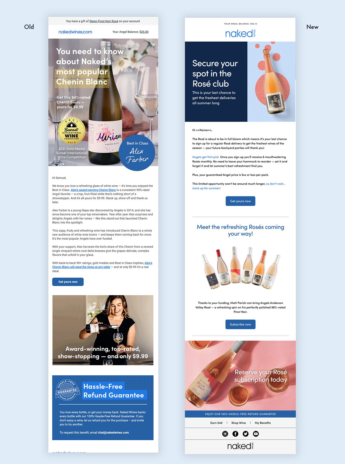
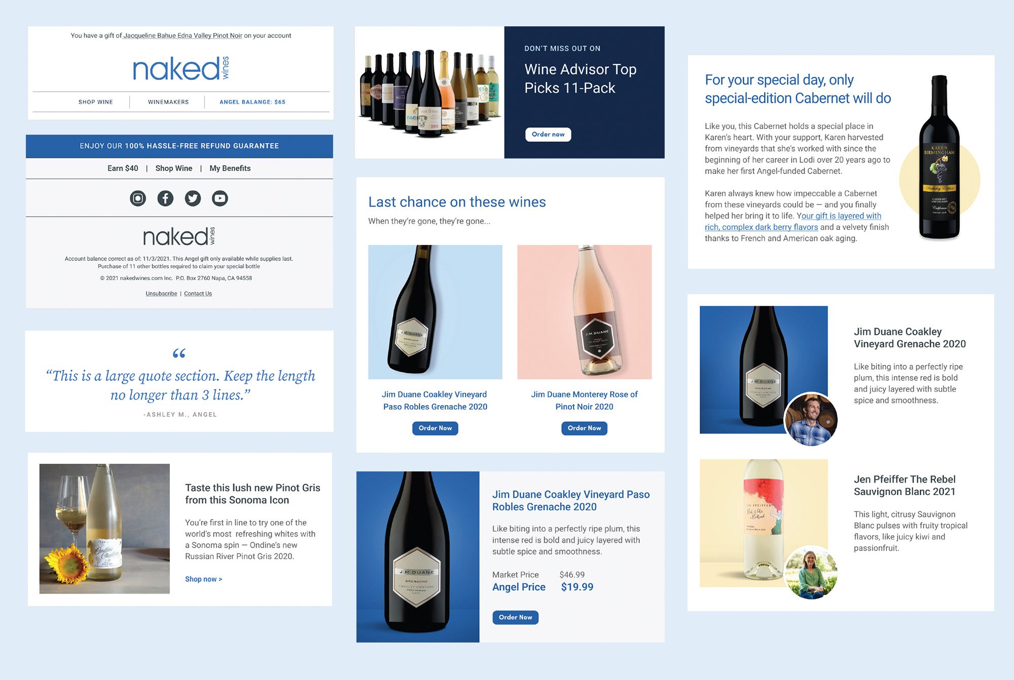
We reevaluated Naked Wines' email marketing, which previously utilized text-only or image-based templates. By applying email best practices, I designed and developed over 50 interchangeable modules in Figma, including headers, footers, content blocks, product features, polling options, video content, and standardized buttons. I also created a standardized font library to maintain consistency. This transition to Figma reduced email design time by 90%.
Art Direction - Photo & Videoshoot
Winemaker Videos
In 2022, I art directed a series of winemaker videos for Naked Wines, featuring veteran winemakers who have long been integral to the brand. Selected for their exceptional expertise, rich winemaking heritage, and impressive array of awards, these winemakers exemplified the brand’s dedication to quality and tradition. The video series highlighted their achievements and deeply resonated with consumers. We paired the shoot with a photoshoot, as well, to further enhance brand awareness and add a personal touch.
Wine Packaging
Art Direction - Design
We reevaluated Naked Wines' email marketing, which previously utilized text-only or image-based templates. By applying email best practices, I designed and developed over 50 interchangeable modules in Figma, including headers, footers, content blocks, product features, polling options, video content, and standardized buttons. I also created a standardized font library to maintain consistency. This transition to Figma reduced email design time by 90%.


